
Outdoor Adventure Club
The Outdoor Adventure Club is dedicated to promoting student outdoor activity and inspiring a connection with nature. Our students actively participate in a range of activities, including rock climbing, hiking, backpacking, camping, and various outdoor experiences.
Branding and Identity Systems
Visual Design
Social Media
What is OAC?
The Outdoor Adventure Club, a student-run organization at Wayne State University, is committed to creating a welcoming and encouraging environment for students to step out of their comfort zones and embark on new adventures. Our mission involves planning exciting trips that offer hands-on experiences in the outdoors, fostering a renewed appreciation for our environment.


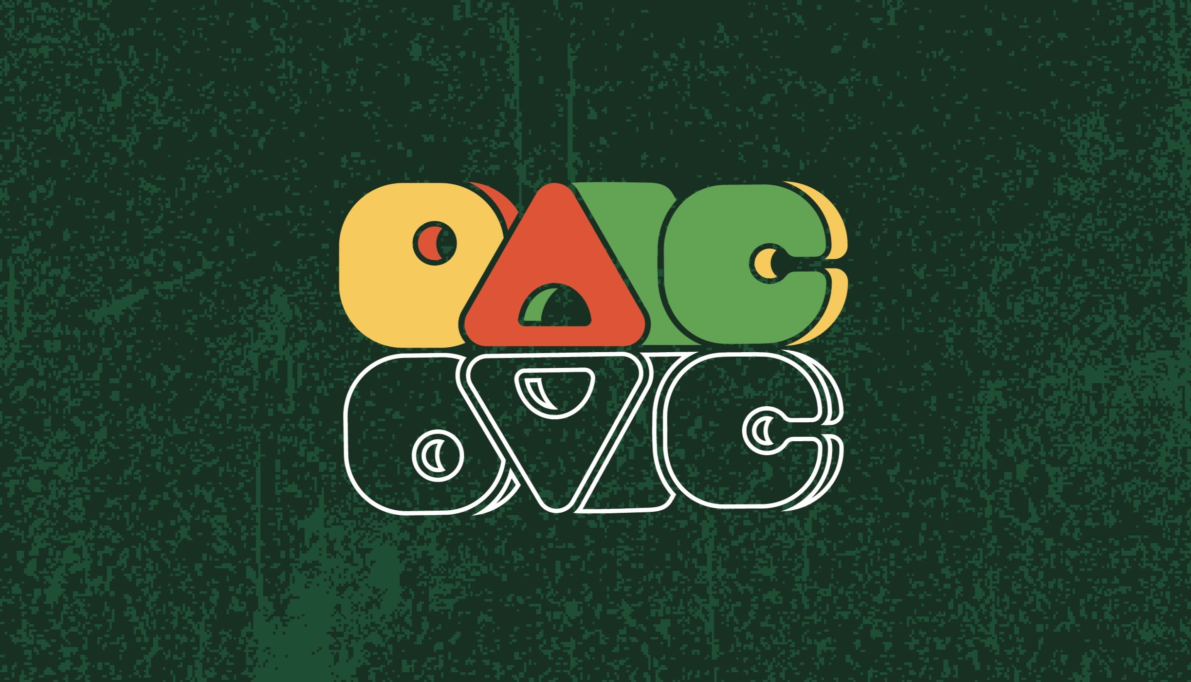
The Logo
The acronym OAC stands for Outdoor Adventure Club, where the club revolves around all things outdoors, including camping, hiking, and climbing. Reflecting this emphasis in the logo, the 'A' is creatively designed to resemble a tent. Given that tent camping is a prevalent activity in the club, this choice symbolizes the diverse outdoor experiences we engage in. Importantly, the logo is crafted to exude a sense of friendliness and warmth, aligning with our goal of welcoming all individuals interested in exploring the outdoors.

The Process
Every creative journey begins with a sketch, and the logo design for OAC was no exception. Before transitioning to the digital realm, I started sketching ideas and concepts in my notebook. This particular project started on a piece of newsprint, where I sought input from various individuals around me, especially focusing on the design of the 'A'. The iterations persisted beyond the physical sketches as I transitioned to Illustrator, cluttering artboards with an array of colors, fonts, sizes, shapes, and textures.
Throughout this process, many eyes provided valuable input, and incorporating their feedback, I made iterative changes that ultimately culminated in the final design of the OAC logo.

Recognizing the significance of colors in shaping a brand's identity, I made intentional choices for the OAC. As the club embodies a welcoming and encouraging environment for individuals of all skill levels, it was crucial to steer clear of cool tones. Instead, I opted for bright, energizing colors that not only convey a sense of fun and excitement but also evoke the adventurous and outdoor spirit of the club.
These vibrant hues are a deliberate departure from the more subdued earth tones commonly associated with nature, aiming to capture the bright and active essence of the Outdoor Adventure Club. The color palette serves as a visual representation of the club's dynamic and inclusive nature.
Colors

My Role
As the president and founder of the Outdoor Adventure Club (OAC), my journey began with a realization at Wayne State University. I noticed a void – a lack of a community for students who shared a passion for spending time outdoors and exploring new interests. Driven by the desire to fill this gap, I set out to create that community, birthing the idea of the OAC.
With the collective efforts of my team, we successfully cultivated a vibrant community of students within the Outdoor Adventure Club. Together, we organized climbing days, participated in competitions, and embarked on outdoor adventures like hiking, camping, and backpacking, fostering countless memorable experiences.


